Design System Audit
Last updated: October 2, 2026
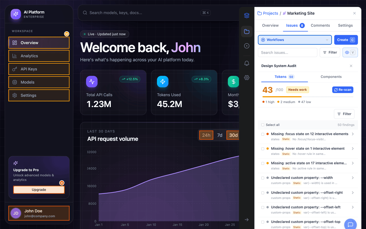
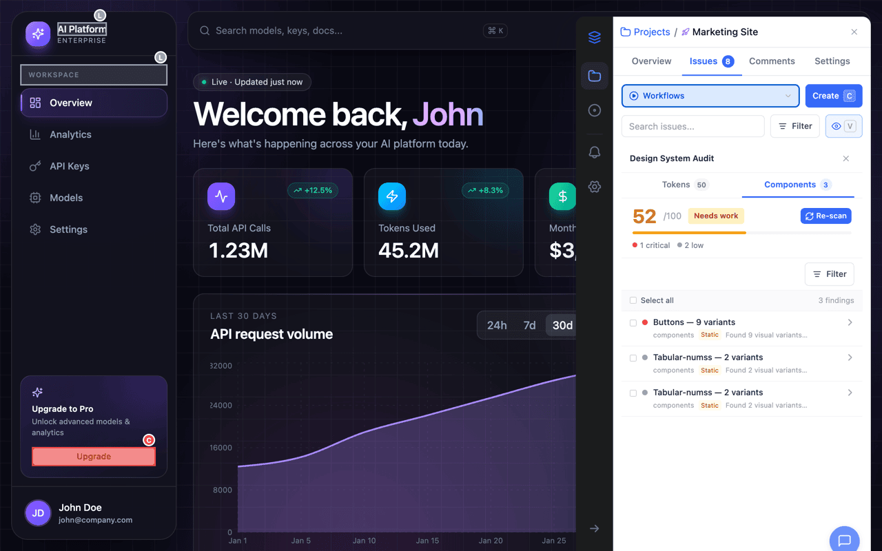
The Design System Audit scans any page for design token inconsistencies across colors, typography, spacing, borders, and shadows, and for components whose instances have drifted apart. It runs as two workflow cards, Design Tokens and Components, scores the page, highlights affected elements directly on it, and lets you create issues, copy findings, or ignore findings in bulk. Design Tokens also runs inside Team Review with no extension installed.
Start an Audit
- Open the OverlayQA sidebar on the page you want to audit.
- Open the Workflows tab in the sidebar's navigation rail, or choose Run Workflows from a project view.
- Pick the Design Tokens card ("Find values that should be tokens.") or the Components card ("Find inconsistent, drifted components.").
Either card opens the Design System Audit panel. Each card runs its own scan, so you can audit tokens and components independently and compare the two scores.
Choose a Design Source (Optional)
Before scanning tokens, the panel offers Compare against your design tokens. Give it a source and the audit checks the live CSS against your real design values instead of only against itself:
- A Figma frame: pick a project and a frame. Needs Figma connected (see Connect Figma).
- A design tokens JSON file: drop a W3C Design Tokens (DTCG) file onto Drop a design tokens JSON, or click to browse, up to 1 MB. Works without a Figma connection.
The source is optional and never blocks the scan; skip it and the audit reports internal inconsistencies only. It applies to the current session and is not saved to the project, so choose it again next time if you want the comparison.
Run the Scan
Click Scan design tokens (or Scan components on the Components card) to start. A progress indicator walks through three steps and the scan typically completes in a few seconds:
| Design Tokens | Components |
|---|---|
| Extracting CSS tokens | Sampling page elements |
| Analyzing consistency | Grouping components |
| Scoring results | Scoring consistency |
Understanding the Score
After the scan completes, a score header displays your page's consistency score (0-100) with a color-coded badge:
| Score | Badge | Meaning |
|---|---|---|
| 70-100 | Good (green) | Tokens are consistent. Few or no deviations from your design system. |
| 40-69 | Needs work (amber) | Moderate inconsistencies found. Review the findings to tighten token usage. |
| Below 40 | Critical (red) | Significant token drift. Many values deviate from expected design tokens. |
Below the score, severity counts show how many Critical, High, Medium, and Low findings were detected. Click Re-scan to run the audit again after making changes; the button waits while the AI analysis is still running.
What Gets Analyzed
Design Tokens analyzes six categories of CSS properties across every visible element on the page:
- Colors: Background colors, text colors, and border colors. Flags values that don't map to a design token.
- Typography: Font family, font size, font weight, and line height. Detects one-off values not in the type scale.
- Spacing: Padding, margin, and gap values. Identifies non-standard spacing that deviates from the spacing scale.
- Borders: Border width, border color, and border radius values.
- Shadows: Box shadow definitions. Flags inconsistent shadow usage.
- Custom properties: CSS custom properties (variables) and their usage patterns.
Components groups visually similar elements and checks whether their styling is consistent across instances, so a button that exists in five slightly different versions shows up as one finding with its variants.
Reading the Findings
Each finding shows a severity indicator, title, category badge, and source badge. Source badges indicate how the finding was detected:
- Static: Detected through pure CSS analysis.
- AI: Enriched with AI-generated analysis and suggestions.
- Figma: Compared against values from the Figma frame you chose as the design source.
Click any finding to expand its detail card. The expanded view shows:
- Found value: The raw CSS value detected, with a color swatch for color findings and frequency count.
- Design comparison (when a source was chosen): Side-by-side of the designed value vs. the live value, with a pass/fail indicator.
- Suggestion: An AI-generated recommendation for fixing the inconsistency.
- Affected elements: A collapsible list of CSS selectors where this value appears (up to 20 elements shown).
Filter and Sort
Click the filter button in the findings toolbar to narrow results. You can filter by:
- Severity: Critical, High, Medium, Low (multi-select).
- Category: Colors, Typography, Spacing, Borders, Shadows, Custom Props (multi-select).
- Sort: Order by Severity (default), Category, or Frequency.
An active filter count badge appears on the filter button. Click Clear all to reset filters.
Page Overlay
While the audit panel is open, affected elements are highlighted directly on the page with colored borders and severity badges. Each highlighted element shows:
- A 2px colored border matching the finding's severity (red for critical, orange for high, blue for medium, gray for low).
- A severity badge in the top-right corner of the element (C, H, M, or L).
- A subtle background tint to make the element stand out.
Click any severity badge on the page to scroll the sidebar to that finding and expand its detail card. If an element has multiple findings, only the highest-severity badge is shown.
Actions on Findings
Each expanded finding has three action buttons:
- Ignore on this page: Hides this finding for the current page only. Useful for intentional exceptions.
- Ignore across project: Hides this finding across all pages in the project. The finding won't appear in future scans.
- Create Issue: Creates an OverlayQA issue from the finding with all context included.
Bulk Actions
Select findings with the checkboxes next to each row, or use Select all at the top. With items selected, a toolbar shows Create issues with the selected count, and an Actions menu with:
- Copy findings, Copy as Markdown, Copy as CSV: Copy the selected findings to the clipboard as plain text, Markdown for a pull request or an AI coding tool, or CSV for a spreadsheet. No tracker needed.
- Ignore on this page: Hides all selected findings on this page.
- Ignore across project: Hides all selected findings project-wide.
- Export token findings to a connected integration (Jira, Linear, Notion, Asana, or Trello).
Design Tokens in Team Review
The Design Tokens scan also runs inside Team Review on any public URL, with nothing installed. The panel opens with Design source (optional): click Choose a Figma frame or tokens JSON, or use Upload tokens JSON and drop a file ("Works without a Figma connection"), then click Scan design tokens. The Components scan stays in the extension; Team Review shows a card that says so and points to the extension.
Tip: For the most complete audit, choose a design source before you scan. Without one, the audit still detects internal inconsistencies but cannot compare against design intent.